Pages

Monday, December 26, 2016

Emerald Creek 2016 Review


Today, I am up on the Emerald Creek blog sharing all my Design Team Dare Challenge projects for 2016 with a month-by-month linked pictorial review.


Since I was fortunate to have joined the Emerald Creek Design Team, the later half of 2016 has just flown by. It has been a fun and embossed filled seven months of Emerald Creek goodness. A big thanks goes out to Kim Evans (EC Owner) for giving me an opportunity to create with her products. It is my fervent hope that my Dare projects bring some measure of pleasure and some inspiration to all you Emerald Creek Dares fans out there.

I am super excited that my 2017 with Emerald Creek will begin with me meeting Kim and some fellow Dare mates at CHA in January. I am looking forward to the adventure and the chance to explore and create with the new releases!

TTFN,


Thursday, December 1, 2016

Emerald Creek Winter Wishes

As the song goes..."It's the most wonderful time of the year!". It is magical merriment with the wonder and beauty of snow (well at least for us northern folks) and the spirit of holiday celebrations of multiple faiths. 

I paired a red and white colour scheme with elements of a distressed wood background, metal and bling for my card take on this month's Emerald Creek Winter Wishes Dare.


Supplies: Victorian Snowflake Charms, snowflake stamp, Noel sentiment stamp, Candy Red embossing powder (Emerald Creek Craft Supplies), patterned paper (Simple Stories), Tim Holtz Picket Fence Distress ink and paint (Ranger), vellum (The Paper Company), VersaMark  (Tsukineko), baker's twine and card base (Recollections), clear jewels (CTMH), red jewels (Dollarama)

I started my card out by randomly stamping the Flakee stamp on a piece of Cedar/White Ledger Simple Stories Snap Basics distressed wood background paper with Picket Fence Distress ink. Once the ink was dry, I splattered the piece with Picket Fence Distress paint to add some more "snow". While that piece was drying, I heat embossed the Noel stamped image on vellum with Candy Red embossing powder. I used a masked stamping technique to add more of the snowflakes and stars to the rest of the vellum stripe, heat embossing as I went along. Then, I attached two of the Mini Victorian Snowflake Charms and one the larger version using baker's twine and glue dots securing the twine at the back with tape. I assembled the card onto a 4" x 5 1/2" card base and then added the red and clear bling bits to finish it off.

You have until the end of the month to enter the Emerald Creek Winter Wishes Dare. Up for grabs is a $50 gift certificate for the Emerald Creek Shop as well as discount codes for purchases. Details, as well as some other awesomely inspirational takes by my fellow Dare-mates, can be found here on the Emerald Creek Blog.

Sending you warmest wishes for a fun and happy holiday season!

TTFN,

Tuesday, November 1, 2016

Lest We Forget

This month, in honour of our veterans, I created this card for Emerald Creek Dares.  As time passes, it is important for us to remember those that made the greatest sacrifice in service to our country... Lest We Forget. It is with great gratitude that we recognize and thank the many men and women that serve our country, protecting rights and freedom, both here at home and around the globe.


First, I Distress inked the card background and the I used the "Remember" stamp from the Fallen Blossom stamp set to create the multi stamped text using a second generation stamping technique to soften and fade it as a background. Then, I heat embossed one of the Remember stampings as a sentiment focal point. Next, the Vintage Timepiece was heat embossed with the Hammered Metal emboss powder and then coloured with a combination of Distress paints and Distress inks. One of the stand alone flowers from the Fallen Blossom set resembles a poppy so I double heat embossed it -first, its' outline in Midnight Black and then filled it with the Candy Red for colour. A little fussy cutting and shaping for both the time piece and poppy to give them dimension. Lastly, I upcycled a Lindt Easter bunny red neck ribbon by aging it with Distress Stain and then threading on two Distress Paint distressed Three Star Metal Bands for a bit of a military touch.


Emerald Creek Products:

EC store products:
Distress Mini Ink Pads: Antique Linen, Vintage Photo, Gathered Twigs, Walnut Stain
Distress Stain: Antique Linen, Vintage Photo

Distress Paint: Peeled Paint, Candy Apple, Antiqued Bronze, Black Soot

For Dare challenge details and to check out my fellow Design Team member's takes on this month's Emerald Creek Dare, please follow this link here.

TTFN,


Monday, October 17, 2016

Falling into Celebration

Part 2 of the Falling into Celebration Dare is up on the Emerald Creek blog today and I have a Diwali card to share with you. To celebrate the Festival of Lights, I went for a stellar display on a Distress ink watercolour galaxy background.


I first stamped the Sunny D sun on a 4 1/4" x 6 1/4" piece of Ranger watercolour paper and heat embossed it using a combination of Tangerine Orange and Vegas Gold emboss powder. Next, I stamped a variety of stars from the Sweet Dreams stamp and heat embossed them in Vegas Gold. To add a bit more light to my future galaxy, I splattered water using a waterbrush and then heat embossed some more Vegas Gold emboss powder on the background.Then came the watercolouring part. I watercoloured the stars using Tim Holtz Scattered Straw mini Distress ink and the sun with combination of Scattered Straw, Dried Marigold, and Ripe Persimmon. Once they were all dry, I wet areas around them using a water brush and then began dropping in other colours (Tumbled Glass, Peacock Feathers, and Wilted Violet). Next, I added Black Soot and Chipped Sapphire, working them with water to allow them to blend. I added in more of the other colours as need until I was pleased with the look. After mounting my dried piece onto black cardstock covered card base, I added the CAC Shishoni Brush script Silhouette cut sentiment to complete the card.


Come celebrate the season with us over at Emerald Creek Dares by entering our Falling into Celebration Dare challenge for a chance to win a $50 store credit. Other projects by my fellow DT mates, can be found here along with the challenge details.


TTFN,


Emerald Creek Products used:

Other Products available in the Emerald Creek Shop:
Mini Distress Inks - Scattered Straw, Dried Marigold, Ripe Persimmon, Tumbled Glass, Peacock Feathers, Wilted Violet, Chipped Sapphire, Black Soot

Saturday, October 1, 2016

Celebrating Fall

As the season turns, we are once again thankful for the fruits of the harvest. For this month's Emerald Creek Dare challenge, I shared an idea for personalized place cards to bring a Fall festive feel to a table setting when celebrating Thanksgiving with family and friends. Loaded with upcycled bits, this project is super easy to put together and uses corrugated cardboard, scraps of burlap, birch bark, and the most readily available and plentiful element of the season... fallen leaves.


I collected a variety of fallen leaves in sizes that would work with the scale of the place card. Try picking those that are newly fallen with greater moisture content. The colour of the leaves is added with emboss powder so you needn't be concerned about the colour of the leaves.

To emboss the leaves, I rubbed a bit of petroleum jelly on the leaves. I used Vegas Gold emboss powder on the oak leaf, Candy Red emboss powder on the maple leaf and a 3/4 to 1/4 mix of Thanksgiving to Tangerine Orange emboss powders on the poplar leaf. I experimented with a variety of ways to adhere the emboss powder to the leaves and while they all worked, I found I really liked the coverage and look of petroleum jelly. It takes a bit longer to activate the emboss powder when heating it and it will bubble due to the moisture content of the leaf. You will get different looks depending how long you heat the emboss powder. I found that I was able to retain a fair amount of detail and truer emboss colour by letting it just get to the heated bubble point but you can heat it for longer causing the leaf to dehydrate and slightly shrink in size. **NB - On a cautionary note, the embossed leaf stays hot longer than normal embossing on paper so be careful with handling until emboss cools.**

The base was made with corrugated cardboard that was scored, folded, and stripped of its' outer layer after being spritzed with water for easier removal. A scrap piece of burlap was glued on with Glue n' Seal and a piece of birch bark was adhered on top of that.

After arranging and adhering the embossed leaves, I used a VersaMark brush pen and hand scripted my guest's name onto the birch bark. I embossed the name with my leftover custom mix of Candy Brown, Mirror Gold, and Vegas Gold emboss powders (see this post here for ratios used).

Come celebrate the season with us over at Emerald Creek Dares by entering our month long Falling into Celebration Dare challenge for a chance to win a $50 store credit. Other awesome projects by my fellow DT members, Deb and Pam, can be found here along with the challenge details.


TTFN,


Emerald Creek Products Used:


Friday, September 16, 2016

Emerald Creek's First Anniversary

In honour of Emerald Creek's First Year Blogiversary and Kim Evan's sojourn into new territories for her business, I decided to follow her lead and spread my wonder-lust wings a bit too! I took the opportunity to embrace the Anything Goes Anniversary Dare and try something very much out of my ordinary repertoire with this altered trellis.


During my quest for a project idea for the Dare and with Emerald Creek's products in mind, my imagination was completely sparked when I spied this small brown metal fairy trellis in my local Dollarama. I just knew that the fairy's outstretched hand would work perfectly with a butterfly and I would be able to work with flowers which I do so like to do.


But, being somewhat practical by nature, I didn't want something solely decorative. I wanted it to be able to able to handle some moisture in use with plants. Thus, it forced me to experiment and get creative with materials to make it work as I envisioned it could.

What I learnt was that... foil alone (even the thicker BBQ variety) was too flimsy to withstand the intricate fussy cutting part of the leaves and ... foil tape would not be cost effective nor practical given the volume of leaves needed and used in the project. What I discover that worked was a form of something I had used in the past to withstand cutting through my Silhouette machine. I adhered regular kitchen aluminium foil to 8 1/2 x 11 cardstock with gel medium. It provides the right amount of support for the foil, it is easy enough to fussy cut, and is not compromised by a bit of moisture due to the foil front and use of gel medium which can withstand water once dry. The foil is easy enough to colour with alcohol inks and equally easy to heat emboss.


I prepped two foil covered cardstock pieces and once they were dried and flattened, I coloured them with Tim Holtz Ranger Alcohol inks. One whole sheet with a mix of Citrus and Clover for the leaves and on the second sheet a 1/4 was coloured with a blend of Sunshine Yellow and Watermelon to create orange for butterflies with a 1/2 part coloured Pool blue for flowers, and the last 1/4 left uncoloured in case of any boo-boos or if I needed more of anything.


For this project, I did a very Kim-esque thing and mixed up a concoction of embossing powders (about equal parts Candy Brown and Mirror Gold with a bit of Vegas Gold Emboss Powder for some sparkle) to get just the right colour and look that I was going for that would compliment and coordinate with the trellis's paint finish.  Working in quarter page increments, I stamped the images with Versamark ink, applied the emboss mixture, and heat set it. Once the pages were completed, I began the task of fussy cutting out all the pieces. Building from the bottom up, I adhered them in place with gel medium on the trellis until I was pleased with the arrangement. Once it was all dry, I placed it in a planter box of Irish Moss. It makes its' home as a cute whimsical addition to our light-filled entrance area.


Supplies: Leafed in the Corner stamp, Fallen Blossom stamp set, Large Butterfly stamp, Candy Brown, Mirror Gold, and Vegas Gold Emboss Powder (Emerald Creek Craft Supplies), VersaMark ink (Tsukineko), No Name Aluminum foil (Loblaws), cardstock (Staples), gel medium (Golden), Tim Holtz Sunshine Yellow, Watermelon, Citrus, Clover, and Pool alcohol inks (Ranger)


I must say that it has been exciting to be a part of Emerald Creek's first year journey into the realm of social media. Congrats to Kim on all her success and growth over the year! Thanks for having me along for the ride and here's to many more adventurous and successful years!


To commemorate the Emerald Creek Anniversary event, the entire DT team have created projects for the post. Be sure to check them all out over on the Emerald Creek blog here. I hope you too take on this month's 'Anything Goes' Dare and join us with one of your own labours of love for a chance to win a $50 gift certificate and a 20% off discount code to the shop.


TTFN,


Tuesday, August 30, 2016

Circle of Friends


I think another title for this post could be Easy and Detailed, you know like those articles that you see in magazines. It was not my original intention to do this. Over the years on my blog, I had done some posts about doing "Add-to"s where I might add an item or two to make something work that was bothering me on a layout well after I had declared it done and posted. With this page, it was more than a simple "Add-to". It all started with inspiration from the More Than Words August main challenge.


I had initially sketched and created this simpler 'Easier' version and at the time when I finished it, I liked it.


I don't know about you but I do not put my newest made pages straight away in an album, rather I display them in my scraproom.  So this is how it came about that as I would enter my scraproom over the next day I thought... umm, it needs more... it needs some black on the circles.  I had debated about inking the edges but that was not practical at that point as they were already adhered to the background so instead I faux stitched them with a pencil. This required the removal of the photos and titling which is where dental floss comes in handy. ;)


Then, I was thinking that it needed a bit more colour added to the border areas. Once that was done, I was thinking that I would draw in more of the red, by adding red paint to the corrugated, chipboard, and cork title letters. However, after I did that, I didn't care for it so I painted them black.


Yet, it still needed something more for the red, so I decided to Archival ink stamp the large Asian flower on patterned paper. Then, I misted, scrunched them, and air dried them. Once dry, I flattened out the shapes a bit, sanded them, and the fussy cut them out, prior to putting some black glitter glue as the centres. I tucked them under the photos helping to create a second visual triangle on the layout and I was pleased by the results.


However, I still had a nagging sense that something was off about the balance of the layout. I solved it with the journaling lines. They help draw your eyes down the page to an end point. Now I feel a sense of rightness and completion with the 'Detailed' version.


Supplies: patterned papers, small and large Asian Bubble Flower stamps, Flowers mask, corrugated letters, chipboard letters, cork letters (Magenta), Tim Holtz Distress inks [Wild Honey, Dried Marigold, Barn Door], Distress Paints [Evergreen Bough, Barn Door, Candied Apple, Black Soot], Black Archival ink (Ranger), Cloudy Sky and Black StazOn (Tsukineko), glitter glue (Hampton Art), pen (CTMH), Sketchy Circles Silhouette cut file (SCT)


Now I know that there are those that will like the easy version over the detailed one and vice versa. That is one of the many beauties of art, it is in the eye of the beholder both as one experiencing it as the viewer or just knowing when it feels done and right for you as the artist creating it.

Magenta is once again the challenge comment sponsor so head on over to the More Than Words Challenge to see the beautiful inspirations by their DT, leave a lovely comment for a chance to win a $25.00 Magenta Gift Certificate, and see the lovely creations of fellow entrants.

TTFN,


Magenta products used:
ME076 Tangerine Odyssey - 10 sheets
Tangerine Odyssey Patterned Paper ME076

Thursday, August 11, 2016

Creative Chemistry 103 - Day 1


Yeah! My Summer of Creative Chemistry continues with the new Tim Holtz Creative Chemistry 103. Right out of the gate Day 1 was jam packed with five techniques. As I want to try to get as much out of the live portion of CC103, I think I will for the most part be going with the Tim standard of using number 8 tags for the techniques. With the weekly focus for the Summer of Creative Chemistry rehash of CC101 and 102, I was able to pick and choose and combine techniques that I wanted to try and I had made cards for the previous 8 weeks. However, I do not think that will be as efficient given the number of new techniques being presented. That being said, I still found that I kept in mind how I was going to use the tag on a card when I chose the items and themes so most will likely be made into cards in the future.


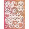
First up, Ombre DIY stamp pad.


Supplies: manila tag, Distress inks [Picked Raspberry, Mustard Seed, Spiced Marmalade, Candied Apple, Picket Fence, Spun Sugar], Rock Candy Stickles (Ranger), Random Quotes and Clear French Market stamps (Stampers Anonymous)


As I had learned from my Week 8 snowflake card experience, Picket Fence can provide some opacity to other Distress ink colours so I applied a layer of Picket Fence ink using the small round applicator around the edges and then went in with Spun Sugar. As one who likes to experiment and try things just like Tim continually encourages participants to do, I tried using the Clear Rock Candy Stickles even though I knew it would re-activate the Distress colours that I had already applied as a border. I had hoped that there would be enough of a hint of pale pink to compliment the ombre and it worked!


Next up, Distress Highlight Stamping. If you had previously read my Summer of Creative Chemistry Week 8 post on my snowflake card and my Picket Fence experience, I found a solution to the dilemma.  I added a lot of reinker to the pad and stamped the image three times using my MISTI and that made a substantial difference.


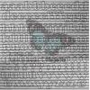
Supplies: kraft tag, Distress ink [Picket Fence, Picked Raspberry, Wild Honey, Twisted Citron, Peacock Feathers, Tea Dye] (Ranger), Papillon stamp set (Stampers Anonymous)

This was actually the second attempt at this tag. While I had no actual issue with the technique, I wanted to mask the butterflies prior to stamping to add colour to the background. So in the spirit of experimenting, I tried using Micro Glaze to mask versus making a paper mask. Well I learnt something new. 


Kraft is not an ideal surface to use this product with as it left a darkened area even after heating it. Not to be deterred, I stamped a second attempt and just made a small cut-out mask shape to get the effect stamped background that that I wanted.


Off-Set Stamping was the next lesson. In looking through my few Tim Holtz stamp sets, I realized that I do not have any from his collection that have enough open areas for colouring so I had to improvise and make do.


Supplies: watercolour paper, kraft tag, black Archival ink, Distress Inks [Seedless Preserves, Wilted Violet, Picked Raspberry, Picket Fence, Lemonade Stand, Mustard Seed, Vintage Photo, Twisted Citron, Peeled Paint, Tumbled Glass, Cracked Pistachio], Dina Wakley Scribbly Birds stamp (Ranger), Random Quotes stamp and Blossom stencil (Stampers Anonymous), pen (CTMH)


The quote on the tag says it all (and the reason I chose that quote) "Out of Limitation comes Creativity". I solved the problem by using a stencil instead of a stamp for the leaves/branches and I went with a Dina Wakley Scribbly bird stamp.

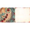
The Distress Washed Watercolour, I found the most challenging and not for what you might think. 


Supplies: watercolour paper, manila tag, black Archival ink, Distress Inks [Salty Ocean, Blueprint Sketch, Antique Linen, Pumice Stone, Cracked Pistachio, Walnut Stain], Distress Stains [Cracked Pistachio, Broken China, Wilted Violet, Twisted citron] Micro Glaze (Ranger), Ribbon stamp from High Society Blueprints stamp set and letters from Clear Thoughts and Phrases stamp set (Stampers Anonymous), Remnant Rub friend word (Advantus)


I had a hard time getting the wash colour area just the right colours and the way that I wanted it to coordinate with the ribbon's blue.  In the end, I was able to achieve it with patience for letting the stains dry between adjustments and then following Tim's advice about going in afterwards and adjusting the colour with Distress inks.

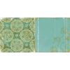
I think the Distress Micro Glaze Resist was my favourite technique of the five. I love how this one turned out!


Supplies: manila tag, Distress Stains [Cracked Pistachio, Broken China, Antique Linen, Vintage Photo], Micro Glaze, Emboss It dabber, Sticky Powder, Gold Foil Sheet (Ranger), Harlequin, Gothic, mini set #1 and Wildflower stencils (Stampers Anonymous)


The photo just doesn't do it justice. It doesn't capture all the details and colours as seen in real life. I had initially stencilled the Wildflowers in black but didn't like it so I realigned the stencil, used the Emboss It dabber, Sticky Powder, and gold foiled over it. It worked wonderfully and was a way better match.


I added a Spun Sugar dyed crinkle ribbon piece to the ombre tag and coordinating trim to the OffSet stamping one.


They are now bookmarks for my daughter and I. Love the results!


TTFN,


Wednesday, August 10, 2016

A Tag and an ATC with July 12 Tags of 2016


While I made my July tag just under the wire at the end of last month for Tim Holtz's 12 Tags of 2016, I felt it was a bit of a dud and chose not to link it up. I wasn't going to post the tag at all, just the ATC. but I am taking the advice of Katelyn Grosart, my fellow Emerald Creek DT teammate, and just post it later. I am thinking that it is sometimes good to show when things don't quite go as planned.


Now don't get me wrong, I do like everything about it other than what happen to the top of the butter knife. As you can see, there was a mishap with the red wash part of my attempt at a checker cloth for my life everyday adventure of eating food. It was a disappointment that it happened after all the effort that I had put in up until that point in the process.


Supplies: watercolour paper, kraft tag, Tim Holtz Distress Inks[Hickory Smoke, Pumice Stone, Walnut Stain, Barn Door, Candy Apple], Micro Glaze, Hickory Smoke Archival ink (Ranger), Day Dream stamp set (Stampers Anonymous), Idea-ology token (Advantus), black cardstock (Bazzill), fonts Arial narrow Bold and Minstral (Silhouette Cameo cutter), burlap and stars (Misc.)


I had used half width cut strips of green painter's tape to mask off the checkered cloth design and the adhesive either interacted or lifted off the micro glaze causing it to allow the stain to go through, much to my dismay. I know I certainly had enough Micro Glaze on prior to putting the tape down and I had worked it into the paper as this was not the first time that I have used it. Oh well! Learned something new. As Tim says... "embrace imperfection" so I am chalking this one up to... "oops oh well!" and "better done than perfect". Love those Dina-isms.

I think I am finding this one easier to take because I also had the ATC, which I was making simultaneously, that turned out well.


Supplies: watercolour paper, Tim Holtz Distress Inks [Cracked Pistachio, Tumbled Glass, Antique Linen, Walnut Stain], Micro Glaze, Black Soot Archival ink (Ranger), Clear Mini Blueprints stamp (Stampers Anonymous), Idea-ology metal arrow and letter sticker (Advantus), kraft cardstock (CTMH), black cardstock (Bazzill), fonts Arial Narrow Bold (Silhouette Cameo cutter)


It was fun trying to size everything to an ATC size which worked well with the mini Blueprint stamp. As I do not own any of the Tim Holtz word dies (yet), I made the look work by using fonts with my Cameo Silhouette. I chose to use Cracked Pistachio for the colour of the sewing machine as an ode to my grandmother's sewing machine, which I inherited and is actually a darker version of that colour. The surrounding shading was done with Tumbled Glass but it unfortunately took on a greenish hue (similar to Cracked Pistachio) once I added the Antique linen. Just another something that I learned from this experience. All in all, I am pleased with how this one turned out. 


TTFN,


Week 8 of Summer of Creative Chemistry

Week 8 had tons of info as it encompassed two days from Creative Creative Chemistry 102. I made two cards combining two techniques from each day section.

The first was a combination of a brayer stained background with faux cracked glass techniques from Day 3.


Supplies: tag, Clear Rock Candy Crackle paint, Glue N' Seal, Distress Stains [Broken China, Antique Linen, Twisted Citron, Lucky Clover, Vintage Photo], Distress ink [Antique Linen, Vintage Photo], Blending Solution (Ranger), markers (Sharpie), Daydreamer stamp set (Stampers Anonymous), small talk occasions stickers (Advantus), twine (Dollarama)


Made due with what I had so I stamped the leaves from the Tim Holtz Daydream stamp set with Saddle Brown StazOn ink onto acetate and then continued on with the technique as presented in the lesson. To colour the leaves, I again had to use what I used Sharpie markers and the Blending Solution. It worked well enough to colour and give the faux cracked glass effect. I will have to try this technique again when my new order of alcohol inks arrives.


The second card was created with emboss techniques from a combination of Sticky Powder with glitter for the background and chalkboard technique with Antiquities emboss powder.


Supplies: kraft cardstock (CTMH), black cardstock (Bazzill), Tim holtz stamper (Stampers Anonymous), Picket Fence and Tumbled Glass Distress ink, Picket Fence stain and Acrylic paint, Emboss It, Sticky Powder emboss, Antiquities (Ranger), glitter (Recollections)


I started with the intention of using Picket Fence Distress ink and my vehicle for the sticky powder but it was really dry and didn't show so well so I gave it a bit of umph of colour with Tumbled Glass Distress. It shows up really quite well on the white. Then, I stamped with VersaMark ink to adhere the sticky powder. Thank goodness for my MISTI as I would not have been able to stamp like that without it!


I tried to added a border of Distress Picket Fence but again really light so I used the Picket Fence stain to dab the edges for a more opaque white look.

While Creative Chemistry 102 is over for the live interactive portion, there is still many techniques that I will go back and try over time. The Summer of Creative Chemistry continues with the much anticipated Creative Chemistry 103.

TTFN,


Monday, August 8, 2016

Week 7 Summer of Creative Chemistry

Week 7 of Tim Holtz's Summer of Creative Chemistry hosted on Online Card Classes saw us creating with alcohol inks as part of Creative Chemistry 102.

Being a proud new owner of five alcohol inks: Watermelon, Raspberry, Citrus, Clover and Sailboat (thanks to Master enabler Tim Holtz combined with a 20% off sale at Simon Says Stamp... sometimes a crafty girl just can't resist! ... LOL so punny!), this was my first attempt at utilizing alcohol inks. I was attempting the ombre technique with the Brights that I had purchased in Raspberry and Watermelon but did not anticipate how BRIGHT the Raspberry would be. It is a lovely colour, don't get me wrong, it just is REALLY bright when compared to the Watermelon. So I just made due and worked it with the blending solution and adding more of each colour to still have the underlying ombre but a balanced tone to it.


Supplies: Glossy Paper, Raspberry and Watermelon Alcohol inks, Tim Holtz stamps (Stampers Anonymous), Black Archival ink, Black emboss powder, Stardust and Frosted Lace Stickles (Ranger), White Signo pen (Mitsubishi Pencil Co.), cardstock (CTMH)

I heat embossed the Tim Holtz Perspectives Butterfly and 'There is Beauty in Simplicity' sentiment to make them stand out. I used second generation stamping on the numbers stamp from the same set to allow it to recede into the background a bit. For some detailing, I  added Frosted Lace Stickles to the outer parts of the butterfly's wings and Star Dust Stickles to the inner portions. Then to give it some pop, I used a White Signo pigment pen to the inside of the font on Beauty, pointilized the sections of the dried Frosted Lace, and mounted it on white cardstock.


My daughter upon seeing the card thought it was awesome but it would be even better if it was in her colours so she requested one for herself in blues. 


As I only had the three other colours (Citrus, Clover, and Sailboat), I started with them in a three part ombre set up and then worked with the blending solution and Sailboat to fashion the background. 


As I had some colour still on the applicators after creating the card base, I worked them on an ATC base in Glossy cardstock and used a variety of other Tim Holtz stamps using the same techniques that I had used on the cards.

I would definitely venture some more with the alcohol inks as there are yet more techniques from the lesson to try and I like the bold vibrant look that it creates.

TTFN,